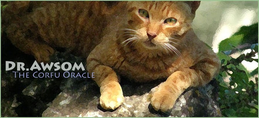
The picture straight from camera was not a bad composition; editing is mostly cleaning up distracting details - entirely with Photoshop 'clone stamp. The rock Molly is sitting on was extended for a better base to the picture.
Most lines tend to lead the eye to Molly's own which was painted a bit - a little colour and a pupil. Her profile was lightened to read better against her body.
The movement in this picture is the strong diagonal - top left > bottom right, and the 'swing' of Molly's head. There is a weak diagonal formed by the branches and the rocks bottom left. This creates a balance.
Molly's outline is fairly clear, but a bit 'lumpy' , not very 'cat-shaped'. This, for me is the main fault.
There is a 'co-incidence' that normally I would have edited out, but left in. Its a small thing but looks almost deliberate. When you find it your eyes will keep returning to it.
Let me know what it is. And thank you for looking.

No comments:
Post a Comment
Do tell me what you think. It's the blood of blogs.